ROC and Precision-Recall Curve
Being a binary decision rule, the hypothesis testing procedure shares many similarities with a two-class classification algorithm. (In a classification algorithm, the goal is to look at the testing sample \(\vy\) and compute certain thresholding criteria. For example, a typical decision rule of a classification algorithm is \(\delta(\vy) = \begin{cases}1, &\, \vw^T\phi(\vy) \ge \tau \\ 0, &\, \vw^T\phi(\vy) < \tau\end{cases}\). Here, you can think of the vector \(\vw\) as the regression coefficient, and \(\phi(\cdot)\) is some kind of feature transform. The equation says that class 1 will be reported if the inner product is larger than a threshold \(\tau\), and class 0 will be reported otherwise. Therefore, a binary classification, when written in this form, is the same as a hypothesis testing procedure.) Given a testing statistic or a testing sample, both the hypothesis testing and a classification algorithm will report YES or NO. Therefore, any performance evaluation metric developed for hypothesis testing is equally applicable to classification and vice versa.
The topic we study in this section is the receiver operating characteristic (ROC) curve and the precision-recall (PR) curve. The ROC curve and the PR curve are arguably the most popular metrics in modern machine learning, in particular for classification, detection, and segmentation tasks in computer vision. There are many unresolved questions about these two curves and there are many debates about how to use them. Our goal is not to add another voice to the debate; rather, we would like to fill in the gap between the hypothesis testing theory (particularly the Neyman-Pearson framework) and these two sets of curves. We will establish the equivalence between the two curves and leave the open-ended debates to you.
9.5.1Receiver Operating Characteristic (ROC)
Our approach to understanding the ROC curve and the PR curve is based on the Neyman-Pearson framework. Under this framework, we know that the optimal decision rule w.r.t. the Neyman-Pearson criterion is the solution to the optimization
As a result of this optimization, the decision rule \(\delta^*\) will achieve a certain false alarm rate \(p_F(\delta^*)\) and detection rate \(p_D(\delta^*)\). Clearly, the decision rule \(\delta^*\) changes as we change the critical level \(\alpha\). Accordingly we write \(\delta^*\) as \(\delta^*(\alpha)\) to reflect this dependency.
What this observation implies is that as we sweep through the range of \(\alpha\)'s, we construct different decision rules, each one with a different \(p_F\) and \(p_D\). If we denote the decision rules by \(\delta_1,\delta_2,\ldots,\delta_M\), we have \(M\) pairs of false alarm rate \(p_F\) and detection rate \(p_D\):
- sep0ex
- Decision rule \(\delta_1\): False alarm rate \(p_F(\delta_1)\) and detection rate \(p_D(\delta_1)\).
- Decision rule \(\delta_2\): False alarm rate \(p_F(\delta_2)\) and detection rate \(p_D(\delta_2)\).
- \(\vdots\)
- Decision rule \(\delta_M\): False alarm rate \(p_F(\delta_M)\) and detection rate \(p_D(\delta_M)\).
If we plot \(p_D(\delta)\) on the \(y\)-axis as a function of \(p_F(\delta)\) on the \(x\)-axis, we obtain a curve shown in Figure 9.24 (see the example below for the problem setting). The black curve shown on the right is known as the receiver operating characteristic (ROC) curve.
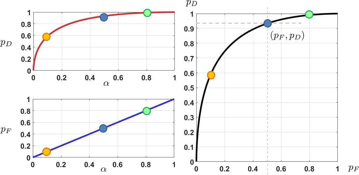
The setup of the figure follows the example below.
We consider two hypotheses: \(H_0: Y \sim \text{Gaussian}(0,4)\), and \(H_1: Y \sim \text{Gaussian}(3,4)\). Derive the Neyman-Pearson decision rule and plot the ROC curve.
We construct a Neyman-Pearson decision rule:
where \(\alpha\) is a tunable critical level. For example, if \(\alpha = 0.05\), then \(\sigma\Phi^{-1}(1-0.05) = 3.2897\), and if \(\alpha = 0.1\), then \(\sigma\Phi^{-1}(1-0.1) = 2.5631\). Therefore, the false alarm rate and the detection rate are functions of the critical level \(\alpha\).
For this particular example, we have the false alarm rate and detection rate in closed form, as functions of \(\alpha\):
These give us the two curves on the left-hand side of Figure 9.24.
- sep0ex
- It is a plot showing \(p_D\) on the \(y\)-axis and \(p_F\) on the \(x\)-axis.
- \(p_D =\) detection rate (also known as the power of the test).
- \(p_F =\) false alarm rate (also known as the type 1 error of the test).
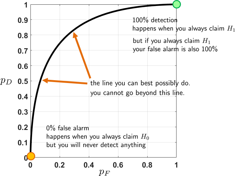
The ROC curve tells us the behavior of the decision rule as we change the threshold \(\alpha\). A graphical illustration is shown in Figure 9.25. There are a few key observations we need to pay attention to:
- sep0ex
- The ROC curve must go through \((0,0)\). This happens when you always keep the null hypothesis or always declare class 0, no matter what observations. If you always keep \(H_0\), certainly you will not make any false positive (or false alarm), because you will never say \(H_0\) is wrong. Therefore, the detection rate (or the power of the test) is also 0. This is a useless decision rule for both classification and hypothesis testing.
- The ROC curve must go through \((1,1)\). This happens when you always reject the null hypothesis, no matter what observations we have. If you always reject \(H_0\), you will always say that “there is a target”. As far as detection is concerned, you are perfect because you have not missed any targets. However, the false positive rate is also high because you will falsely declare a target when there is nothing. Therefore, this is also a useless decision rule.
- The ROC curve tells us the operating point of the decision rule as we change the threshold. A threshold is a universal concept for both hypothesis testing and classification. In hypothesis testing, we have the critical level \(\alpha\), say 0.05 or 0.1. In classification, we also have a threshold for judging whether a sample should be classified as class 1 or class 0. Often in classification, the intermediate estimates are probabilities or distances to decision boundaries. These real numbers need to be binarized to generate a binary decision. The ROC curve tells us that if you pick a threshold, your decision rule will have a certain \(p_F\) and \(p_D\) as predicted by the curve. If you want to tolerate a higher \(p_F\), you can move along the curve to find your operating point.
- The ideal operating point on a ROC curve is when \(p_F = 0\) and \(p_D = 1\). However, this is a hypothetical situation that does not happen in any real decision rule.
9.5.2Comparing ROC curves
Because of how the ROC curves are constructed, every binary decision rule has its own ROC curve. Typically, when one tries to compare classification algorithms, the area under the curve (AUC) occupied by the ROC curve is compared. A decision rule having a larger AUC is often a “better” decision rule.
To illustrate the idea of comparing estimators, we consider a trivial decision rule based on a blind guess.
(A blind guess decision) Consider a decision rule that we reject \(H_0\) with probability \(\alpha\) and keep \(H_0\) with probability \(1-\alpha\). We call this a blind guess, since the decision rule ignores observation \(y\). Mathematically, this trivial decision rule is
Find \(p_F\), \(p_D\), and AUC.
For this decision rule we compute its false positive rate (or false alarm rate) and its true positive rate (or detection rate). However, since \(\delta(y)\) is now random, we need to take the expectation over the two random states that \(\delta(y)\) can take. This gives us
Similarly, the detection rate is
If we plot \(p_D\) as a function of \(p_F\), we notice that the function is a straight line going from \((0,0)\) to \((1,1)\). This decision rule is useless. Comparing this with the Neyman-Pearson decision rule, it is clear that Neyman-Pearson has a larger AUC. The AUC for this trivial decision rule is the area of the triangle, which is 0.5.
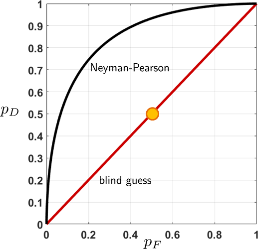
If you set \(\alpha = 0.5\), then the decision rule becomes
This is equivalent to flipping a fair coin with probability \(1/2\) of declaring \(H_0\) and \(1/2\) declaring \(H_1\). Its operating point is the yellow circle.
Computing the AUC can be done by calling special library functions. However, to spell out the details we demonstrate something more elementary. The program below is a piece of MATLAB code plotting two ROC curves corresponding to two different decision rules. The first decision rule is the trivial decision rule, where we have just shown that \(p_F(\alpha) = p_D(\alpha) = \alpha\). The second decision rule is the Neyman-Pearson decision rule, for which we showed in Figure 9.24 that \(p_F(\alpha) = \alpha\) and \(p_D(\alpha) = 1-\Phi\left(\Phi^{-1}(1-\alpha) - \frac{\mu}{\sigma}\right)\). Using the MATLAB code below, we can plot the two ROC curves shown in Figure 9.26.
% MATLAB code to plot ROC curve
    sigma = 2;  mu = 3;
    alphaset = linspace(0,1,1000);
    PF1 = zeros(1,1000); PD1 = zeros(1,1000);
    PF2 = zeros(1,1000); PD2 = zeros(1,1000);
    for i=1:1000
        alpha = alphaset(i);
        PF1(i) = alpha;
        PD1(i) = alpha;

        PF2(i) = alpha;
        PD2(i) = 1-normcdf(norminv(1-alpha)-mu/sigma);
    end
    figure;
    plot(PF1, PD1,'LineWidth', 4, 'Color', [0.8, 0, 0]); hold on;
    plot(PF2, PD2,'LineWidth', 4, 'Color', [0, 0, 0]); hold off;
To compute the AUC we perform a numerical integration:
where \(\alpha_i\) is the \(i\)th critical level we use to plot the ROC curve. (We assume that the \(\alpha\)'s are sorted in ascending order.) In MATLAB, the commands are
auc1 = sum(PD1.*[0 diff(PF1)])
    auc2 = sum(PD2.*[0 diff(PF2)])
The AUC of the two decision rules computed by MATLAB are 0.8561 and 0.5005, respectively. The small slack of 0.0005 is caused by the numerical approximation at the tail, which can be ignored as long as you are consistent for all the ROC curves.
The commands for Python are analogous to the commands for MATLAB.
# Python code to plot ROC curve
    import numpy as np
    import matplotlib.pyplot as plt
    import scipy.stats as stats

    sigma = 2; mu = 3;
    alphaset = np.linspace(0,1,1000)
    PF1 = np.zeros(1000); PD1 = np.zeros(1000)
    PF2 = np.zeros(1000); PD2 = np.zeros(1000)
    for i in range(1000):
      alpha = alphaset[i]
      PF1[i] = alpha
      PD1[i] = alpha
      PF2[i] = alpha
      PD2[i] = 1-stats.norm.cdf(stats.norm.ppf(1-alpha)-mu/sigma)
    plt.plot(PF1,PD1)
    plt.plot(PF2,PD2)
To compute the AUC, the Python code is (continuing from the previous code):
auc1 = np.sum(PD1 * np.append(0, np.diff(PF1)))
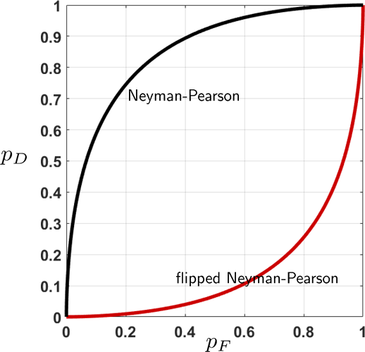
auc2 = np.sum(PD2 * np.append(0, np.diff(PF2)))It is possible to get a decision rule that is worse than a blind guess. The following example illustrates a trivial setup.
(Flipped Neyman-Pearson). Consider two hypotheses
Let \(\alpha\) be the critical level. The Neyman-Pearson decision rule is
Now, consider a flipped Neyman-Pearson decision rule
Find \(p_F\), \(p_D\), and AUC for the new decision rule \(\delta^+\).
Since we flip the rejection zone, the probability of false alarm is
Similarly, the probability of detection is
If you plot \(p_D\) as a function of \(p_F\), you will obtain a curve shown in Figure 9.27. The AUC for this flipped decision rule is 0.1439, whereas that for Neyman-Pearson is 0.8561. The two numbers are complements of each other, meaning that their sum is unity.
What if we arbitrarily construct a decision rule that is neither Neyman-Pearson nor the blind guess? The following example demonstrates one possible choice.
Consider two hypotheses
Let \(\alpha\) be the critical level. Consider the following decision rule:
Find \(p_F\), \(p_D\), and AUC for the new decision rule \(\delta^\clubsuit\).
The probability of false alarm is
Similarly, the probability of detection is
If you plot \(p_D\) as a function of \(p_F\), you will obtain a curve shown in Figure 9.28. The AUC for this proposed decision rule is 0.7534, whereas that of Neyman-Pearson is 0.8561. Therefore, the Neyman-Pearson decision rule is better.
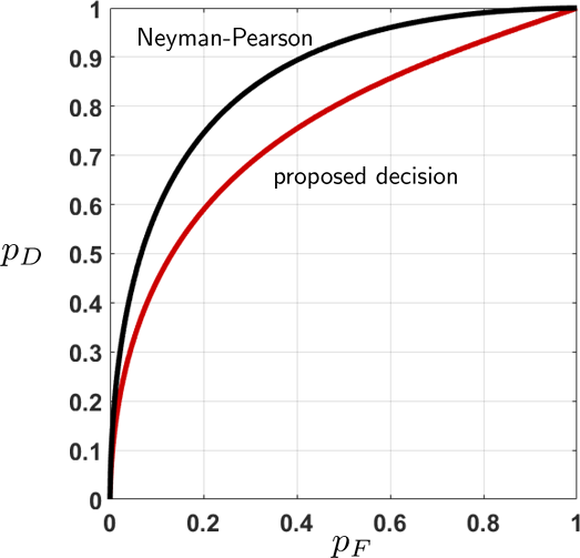
The MATLAB code we used to generate Figure 9.28 is shown below. Note that we need to separate the calculations of the two curves, because the proposed curve can only take \(0 < \alpha < 0.5\). The Python code is implemented analogously.
% MATLAB code to generate the ROC curve.
    sigma = 2;  mu = 3;
    PF1 = zeros(1,1000); PD1 = zeros(1,1000);
    PF2 = zeros(1,1000); PD2 = zeros(1,1000);
    alphaset = linspace(0,0.5,1000);
    for i=1:1000
        alpha = alphaset(i);
        PF1(i) = 2*alpha;
        PD1(i) = 1-(normcdf(norminv(1-alpha)-mu/sigma)-...
                    normcdf(-norminv(1-alpha)-mu/sigma));
    end
    alphaset = linspace(0,1,1000);
    for i=1:1000
        alpha = alphaset(i);
        PF2(i) = alpha;
        PD2(i) = 1-normcdf(norminv(1-alpha)-mu/sigma);
    end
    figure;
    plot(PF1, PD1,'LineWidth', 4, 'Color', [0.8, 0, 0]); hold on;
plot(PF2, PD2,'LineWidth', 4, 'Color', [0, 0, 0]); hold off;import numpy as np
import matplotlib.pyplot as plt
import scipy.stats as stats
sigma = 2; mu = 3;
PF1 = np.zeros(1000); PD1 = np.zeros(1000)
PF2 = np.zeros(1000); PD2 = np.zeros(1000)
alphaset = np.linspace(0,0.5,1000)
for i in range(1000):
alpha = alphaset[i]
PF1[i] = 2*alpha
PD1[i] = 1-(stats.norm.cdf(stats.norm.ppf(1-alpha)-mu/sigma) \
-stats.norm.cdf(-stats.norm.ppf(1-alpha)-mu/sigma))
alphaset = np.linspace(0,1,1000)
for i in range(1000):
alpha = alphaset[i]
PF2[i] = alpha
PD2[i] = 1-stats.norm.cdf(stats.norm.ppf(1-alpha)-mu/sigma)
plt.plot(PF1, PD1)
plt.plot(PF2, PD2)9.5.3The ROC curve in practice
If the Neyman-Pearson decision rule is the optimal rule, why don't we always use it? The problem is that in practice we may not have access to the distributions. For example, if we classify images, how do we know that the data follows a Gaussian distribution or a mixture of distributions? Consequently, the ROC curves we discussed in the subsections above are the theoretical ROC curves. In practice, we plot the empirical ROC curves.
Plotting an empirical ROC curve for a binary classification method (and hypothesis testing) is intuitive. The ingredients we need are a set of scores and a set of labels. The scores are the probability values determining the likelihood of a sample belonging to one class. Generally speaking, for empirical data this requires looking at the training data, building a model, and computing the likelihood. We will not go into the details of how a binary classifier is built. Instead, we assume that you have already built a binary classifier and have obtained the scores. Our goal is to show you how to plot the ROC curve.
The following MATLAB code uses a dataset fisheriris. The code builds a binary classifier and returns the scores.
% MATLAB code to train a classification algorithm.
    % Do not worry if you cannot understand this code.
    % It is not the focus on this book.
    load fisheriris
    pred = meas(51:end,1:2);
    resp = (1:100)'>50;
    mdl = fitglm(pred,resp,'Distribution','binomial','Link','logit');
    scores = mdl.Fitted.Probability;
    labels = [ones(1,50), zeros(1,50)];
    save('ch9_ROC_example_data','scores','labels');
To give you an idea of how the scores of the classifier look, we plot the histogram of the scores in Figure 9.29. As you can see, there is no clear division between the two classes. No matter what threshold \(\tau\) we use, some cases will be misclassified.
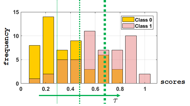
fisheriris. The green vertical lines represent the threshold for turning the scores into binary decisions. Any score greater than \(\tau\) will be classified as Class 1, and any score that is less than \(\tau\) will be classified as Class 0. These predicted labels would then be compared to the true labels to plot the ROC curve.Recall that the ROC curve is a function of \(p_D\) versus \(p_F\). Using terminology from statistics, \(p_D\) is the true positive rate and \(p_F\) is the false positive rate. By sweeping a range of decision thresholds (over the scores), we can compute the corresponding \(p_F\)'s and \(p_D\)'s. On a computer this can be done by setting up two columns of labels: the true label labels and the predicted labels prediction. For any threshold \(\tau\), we binarize the scores to turn them into a decision vector. Then we count the number of true positives, true negatives, false positives, and false negatives. The total of these numbers will give us \(p_F\) and \(p_D\).
In MATLAB, the above description can be easily implemented by sweeping through the range of \(\tau\).
% MATLAB code to generate an empirical ROC curve
    load ch9_ROC_example_data
    tau = linspace(0,1,1000);
    for i=1:1000
        idx   = (scores <= tau(i));
        predict = zeros(1,100);
        predict(idx)   = 1;
        true_positive  = 0; true_negative  = 0;
        false_positive = 0; false_negative = 0;
        for j=1:100
            if (predict(j)==1) && (labels(j)==1)
                true_positive = true_positive + 1;   end
            if (predict(j)==1) && (labels(j)==0)
                false_positive = false_positive + 1; end
            if (predict(j)==0) && (labels(j)==1)
                false_negative = false_negative + 1; end
            if (predict(j)==0) && (labels(j)==0)
                true_negative = true_negative + 1;   end
        end
        PF(i) = false_positive/50;
        PD(i) = true_positive/50;
    end
    plot(PF, PD, 'LineWidth', 4, 'Color', [0, 0, 0]);
The Python codes of this problem are similar. We give them here for completeness.
# Python code to generate an empirical ROC curve
    import numpy as np
    import matplotlib.pyplot as plt
    import scipy.stats as stats
    scores = np.loadtxt('ch9_ROC_example_data.txt')
    labels = np.append(np.ones(50), np.zeros(50))
    tau = np.linspace(0,1,1000)
    PF = np.zeros(1000)
    PD = np.zeros(1000)
    for i in range(1000):
      idx = scores<= tau[i]
      predict = np.zeros(100)
      predict[idx] = 1
      true_positive  = 0;   true_negative  = 0
      false_positive = 0;   false_negative = 0
      for j in range(100):
        if (predict[j]==1) and (labels[j]==1): true_positive  += 1
        if (predict[j]==1) and (labels[j]==0): false_positive += 1
        if (predict[j]==0) and (labels[j]==1): false_negative += 1
        if (predict[j]==0) and (labels[j]==0): true_negative  += 1
      PF[i] = false_positive/50
      PD[i] = true_positive/50
    plt.plot(PF, PD)
The empirical ROC curve for this problem is shown in Figure 9.30. Each point on the curve is a coordinate \((p_F,p_D)\), evaluated at a particular threshold \(\tau\). Mathematically, the decision rule we used was
For every \(\tau\), we have a false alarm rate and a detection rate. Since this is an empirical dataset with only 100 samples, there are many occasions where \(p_F\) does not change but \(p_D\) increases, or \(p_D\) stays constant but \(p_F\) increases. For this particular example, we can compute the AUC, which is 0.7948.
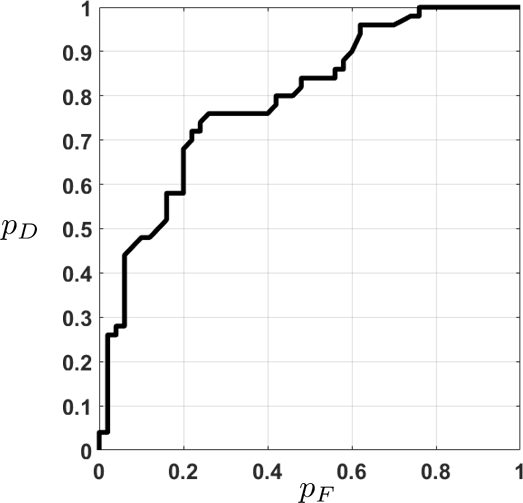
fisheriris, using a classifier based on logistic regression.Note that the empirical ROC is rough. It does not have the smooth concave shape of the theoretical ROC curve. One can prove that if the decision rule is Neyman-Pearson, i.e., if we conduct a likelihood ratio test, then the resulting ROC curve is concave. Otherwise, you can still obtain an empirical ROC curve for real datasets and classifiers. However, the shape is not necessarily concave.
9.5.4The Precision-Recall (PR) curve
In modern data science, an alternative performance metric to the ROC curve is the precision-recall (PR) curve. The precision and recall are defined as follows.
Let TP = true positive, FP = false positive, FN = false negative. The precision is defined as
and the recall is defined as
In this definition, TP, FP, and FN are the numbers of samples that are classified as true positive, false positive, and false negative, respectively. However, both precision and recall are defined as ratios of numbers. The ratios can be equivalently defined through the rates. Using our terminology, this gives us the definitions in terms of \(p_D\), \(p_F\) and \(p_M\). Since \(p_D = 1-p_M\), it also holds that the recall is \(p_D\).
Let us take a moment to consider the meanings of precision and recall. Precision is defined as
The numerator of the precision is the number of true positive samples and the denominator is the total number of positives that you claim. This includes the true positives and the false positives. Therefore, precision measures how trustworthy your claim is. There are two scenarios to consider:
- sep0ex
- High precision: This means that among all the positives you claim, many of them are the true positives. Therefore, whatever you claim is trustworthy. One possibility for obtaining a high precision is that the critical level \(\alpha\) of the Neyman-Pearson decision rule approaches 0. In other words, you are very accepting of the null hypotheses. Thus, whenever you reject, it will be a reliable reject.
- Low precision: This means that you are overclaiming the positives, and so there are many false positives. Thus, even though you claim many positives, not all are trustworthy. One reason why low precision occurs is that you are too eager to reject the null. Thus you tend to overkill the unnecessary cases.
A similar analysis can be applied to the recall. The recall is defined as
The difference between the recall and the precision is the denominator. For recall, the denominator is the total number of positives in the distribution. We are not interested in knowing what you have claimed but in knowing how many of them are in the distribution. If you examine the definition using \(p_D\), you can see that recall is the probability of detection — how successfully you can detect a target. A high recall and a low recall can occur in two situations:
- sep0ex
- High recall: This means that you are very good at detecting the target or rejecting the null appropriately. A high recall can happen when the critical level \(\alpha\) is high so that you never miss a target. However, if the critical level \(\alpha\) is high, you will suffer from a low precision.
- Low recall: This means that you are too accepting of the null hypotheses, and so you never claim that there is a target. As a result, the number of successful detections is low. However, having a low recall can buy you high precision because you do not reject the null unless it has extreme evidence (hence there is no false alarm).
As you can see from the discussions above, the precision-recall curve has a trade-off, just as the ROC curve does. Since the PR curve and ROC curve are derived from \(p_F\) and \(p_D\), there is a one-to-one correspondence. This can be proved by rearranging the terms in the previous theorem.
The false alarm rate \(p_F\) and the detection rate \(p_D\) can be expressed in terms of the precision and recall as
This result implies that whenever we have an ROC curve we can convert it to a PR curve. Moreover, whenever we have a PR curve we can convert it to an ROC curve. Therefore, there is no additional information one can squeeze out by converting the curves. What we can claim, at most, is that the two curves offer different ways of interpreting the decision rule.
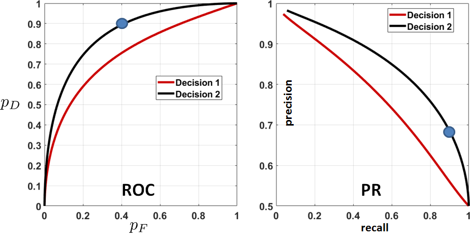
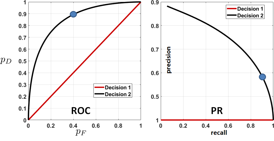
To illustrate the equivalence between an ROC curve and a PR curve, we plot two different decision rules in Figure 9.31. Any point on the ROC curve will have a corresponding point on the PR curve, and vice versa.
The MATLAB and Python codes for generating the PR curve are straightforward. Assuming that we have run the code used to generate Figure 9.28, we plot the PR curve as follows (this will give us Figure 9.31).
% MATLAB code to generate a PR curve
    precision1 = PD1./(PD1+PF1);
    precision2 = PD2./(PD2+PF2);
    recall1    = PD1;
    recall2    = PD2;
    plot(recall1, precision1, 'LineWidth', 4); hold on;
plot(recall2, precision2, 'LineWidth', 4); hold off;Suppose that the decision rule is a blind guess:
Plot the ROC curve and the PR curve.
: As we have shown earlier, \(p_F(\alpha)\) and \(p_D(\alpha)\) for this decision rule are \(p_F(\alpha) = \alpha\) and \(p_D(\alpha) = \alpha\). Therefore,
Thus the PR curve is a straight line with a level of 0.5.
Convert the ROC curve in Figure 9.30 to a PR curve.
: The conversion is done by first computing \(p_F\) and \(p_D\). Defining the precision and recall in terms of \(p_F\) and \(p_D\), we plot the PR curves below.
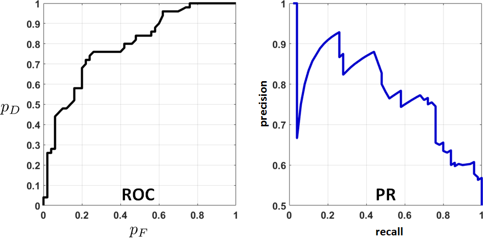
As you can see from the figure, the PR curve behaves very differently from the ROC curve. It is sometimes argued that the two curves can be interpreted differently, even though they describe the same decision rule for the same dataset.